Figuring out why the web became resilient you have to take a closer look on history itself
There has always been an invention before the invention, like the screw press for winemaking before Guttenberg´s printing press or the QWERTY keyboard equal to the phone screens we know today, which was originally in an order to avoid the clashing of metal the pieces on a typing machine. “Scientific progress would be impossible without a shared history of learning to build upon”. More than half a decade ago a lot of money and resources were invested in Cern for pure scientific research to have knowledge as a return on investment. One very important expert was Tim Berners-Lee, a computer scientist who wrote the software “Enquire” (named after a Victorian manual of domestic life called “Enquire Within Upon Everything”) and created a large document called “Information Management: A proposal”.
The internet does not have a center which is one reason why it is resilient. This comes from its origin source, a military purpose. It is a dump network but gains complexity through the system of links, the "href” attribute that allow casting off from one URL to another. “These links turn the web from being a straightforward storage and retrieval system into a hypertext system, using HTTP. The very first version of HTML (Hypertext Markup Language) had only 21 elements, like TITLE, P, UL, LI, H1, H2 for simple texts, headlines and sub headlines.
The confusingly called “world wide web” at the time became truly accessible for the world after Nicola Pellow invented the Line Mode Browser. A simple but powerful browser to run on any machine. From there as technology moved forward new and improved browsers appear. There is a simple answer to the question, how old a browser is because a browser works simple. It grew from 21 to 121 elements in HTML5. Elements, also referred to as tags like “<p>some text</p>” show us the beginning and the closing of a tag. The browser displays the content between those tags, so if the tag is unknown for the browser it displays the whole line. This means the browser is an older version then the version of the HTML file. The displayed line shows that the element or tag was not included in this browser's version. One very powerful element for instance is the “href”-tag, the opportunity to link content and refer to other resources on the web.
When in come to style and appearance of content Håkon Wium Lie together with the Dutch programmer Bert Bos who worked at Cern at the same time as Tim Berners-Lee, created the Cascading Style Sheets, the “CSS” to give HTML a design guideline. The CSS is not only helping the HTML to design all elements but is also responsible for the disappearance of the unknown elements, what the browser would display in an ugly way.
In times of the Microsoft Internet Explorer and the Netsky Navigator designer where not using the CSS much because it was not supported by a lot of browsers. Once a lot of designers realized that CSS is actually making web design more creative and productive everything switched to CSS. Like the CSS Zen Garden from Dave Shea as a showoff on what CSS can do. HTML and CSS have a from partnership and are defined as loosely coupled with attributes like “class” and “id”.
It became a challenge to (web)designer to get from paper to pixel. Starting with a width from 640px to 800px and 1024px, however 960px became the golden number for a regular web layout. Which is not necessary since a web browser's nature is to be flexible in its width.
In 2007 everything changed again when Steve Jobs introduced the first IPhone to browse in the world wide web. A lot of questions came up like “How do you know if the website is entered from a mobile device or not?”.
“One Web means making, as far as is reasonable, the same information and services available to users irrespective of the device they are using.” It was in 2010 when Ethan Marcotte spoke about a responsive design, as a new approach for creating websites. The first experiments in responsive design were to controvert pixels to percentage and adding media queries to remove the grid layout on smaller screens. There emerged an issue what Luke Wroblewski pointed out: You need to priorities your content because there is simply not enough room for everything. Web designers were now not confronted with the right screen size for their designs, they had to focus on the content itself.
What else gives the web complexity is the fact that there are several languages for programming that emerged over time.
The solution for a code that runs in the world wide web is JavaScript. JavaScript gives designers the opportunity to a page even if it is already uploaded. It became popular after the article “A New Approach to Web Applications by Jesse James Garrett" was released. It described how smoother user experience is possible. But, if you build something for the web you can never be sure how many of the web technology is supported by the users´ devices. There is always an amount of uncertainty because of the messy and unpredictable characteristics of the web itself.


The layers for a resilient web design
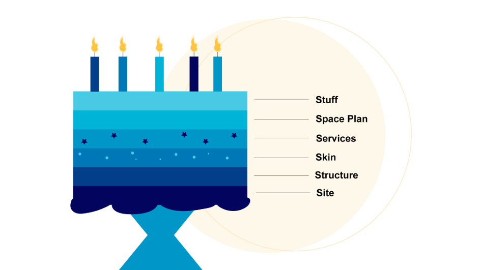
The next chapter focuses on how to start with resilient web design. For this purpose, Keith suggests the following layers:
- Site: domain
- Structure
- Skin
- Services
- Space Plan
- Stuff: updated in hour, minute

Every layer relies on its predecessor and therefore it cannot be independent. For example, CSS and JavaScript need HTML as a basis. Additionally, each successive layer allows an “adjacent possible” which opens even more chances. It is really like having a neighbor – you can borrow sugar or milk which essentially means that you can profit from living next to people, like the layers can profit from existing next to each other. It is also like a cake: it needs a base to build on – the decor, candles and other layers are just fancy add-ons and allow different flavor combinations.
In order to apply this way of web designing, it is important to start from the lowest point in the structure which means to make the bare minimum. This might sound counter-progressive but it is important to keep in mind that not every browser can handle the same experience for a website. Keith highlights this by a question from Dan Cederhom: “Do websites need to look the same?” His simple answer is “no”.
First, the content is important, the message needs to be delivered – it doesn’t matter if the fancy stuff like Google Maps doesn’t work in some browsers as long as the core is there. This phrase from Keith is an important keynote: “Support every browser but optimize for none.” Everyone should have the same access to the content but not everyone needs the same experience. Keith takes a nice provider as an example: The core functionality here is to make the articles readable and provide news. All the other things can be added later on.
With the steps of finding core functionality, providing it with the simplest technology, and enhancing in mind, he proceeds to talk about technical credit – start with the core and enhance, enhance, enhance. It allows developers to experiment with every new technology possible without worrying if it is correctly displayed on every browser as long as everyone has access to the content and can use the core functionality.
In the last chapter, Keith asks to be open-minded, to be brave, and allow change. Many ideas have been rejected over time – until the gates of change have opened. The same needs to happen for resilient web design: Everything new is uncertain and takes time as there might be new skills required, but according to Keith this hard work is going to pay off. The result is a website that responds to unexpected circumstances. The first step to change the process is the tools. They are the conductors of web design; they tell every web designer how their workflow looks like. In order to choose the right conductor, Keith suggests keeping the philosophy of these tools in mind and ask: “Do these philosophies align with my tasks?”
Last but not least Keith asks: “What does the future bring?” He simply says to not ponder too much about it, but embrace it, behave in a “future-friendly way” and help others adapt to the change as well. Only then it is possible to act on that change, as there was a lot of assumption made in the future and this will highly likely not change too soon as the invasion of mobile has proven.
It provides a foundation for understanding technological progress and is essentially a primer on how breakthrough ideas happen and how resilient ideas endure.
Where to go from here #
References #
Gooding, S. (2017, April 7). Recommended Reading: Resilient Web Design, a Free e-Book from Jeremy Keith. WP Tavern. https://wptavern.com/recommended-reading-resilient-web-design-a-free-e-book-from-jeremy-keith
Keith, J. (2016). Resilient Web Design [Book]. Resilient Web Design. Retrieved 4 February 2022, from https://resilientwebdesign.com/
Keith, J. (2017, March 23). The Road To Resilient Web Design. Smashing Magazine. https://www.smashingmagazine.com/2017/03/resilient-web-design/

